When I found out Armin and Bryony of UnderConsideration live in Bloomington, Indiana, I had to drive out and meet them. I live just a couple hours away in Indianapolis. I was born and raised here, and I went to college in Bloomington. Going back felt like a walk down memory lane. I wanted to ask what they thought of life as creatives in the Midwest and hear their story of building one of the most-read, most-respected, and most-feared design blogs on the Internet. They had plenty to share.
Brand New has been published since October of 2006 when it was spun-off from the now unpublished Speak Up.
How has UnderConsideration changed since you guys started it?
Bryony: The essence of UnderConsideration hasn’t really changed — which is just to do things that interest us.
“We started Speak Up in 2002 because there was nothing like it. There wasn’t a place to talk about logos.”
Armin: We started Speak Up because what we wanted to read or talk about online as graphic designers just wasn’t there. The essence has remained the same in that we’re creating the things we want that aren’t out there yet. What has changed dramatically is that when we started Speak Up, we had full-time jobs. It was a side thing on the weekends. We thought graphic design for clients would be 50 percent of our income.
Bryony: But then we thought, “Maybe we can monetize it,” and started advertising. It was at the height of the blogs, so it worked. But it wasn’t driven by that. If we hadn’t had advertisers, we would have continued just the same.

Armin: After the recession of 2008, we had to change gears dramatically because we had no income. We thought, “All right, so let’s lean on this.” By that time, Brand New had grown quite a bit.
Bryony: We’d experimented by publishing a book about portfolios. When we saw that that worked, we were like, “Okay, let’s take a bigger gamble and organize the first Brand New conference.”
Armin: The other constant is that it’s still just me and Bryony. We don’t have employees or project managers.
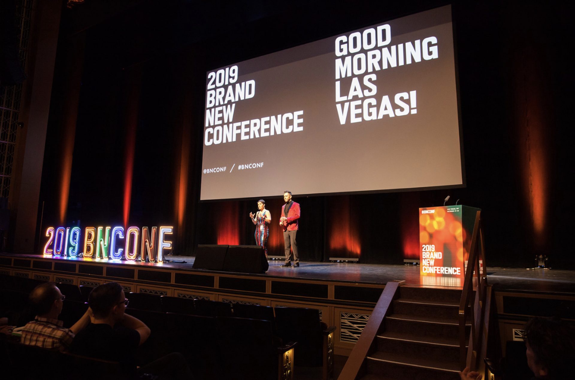
Brand New Conference will be celebrating it’s 11th year in 2020 with the event happening in Austin, TX this October
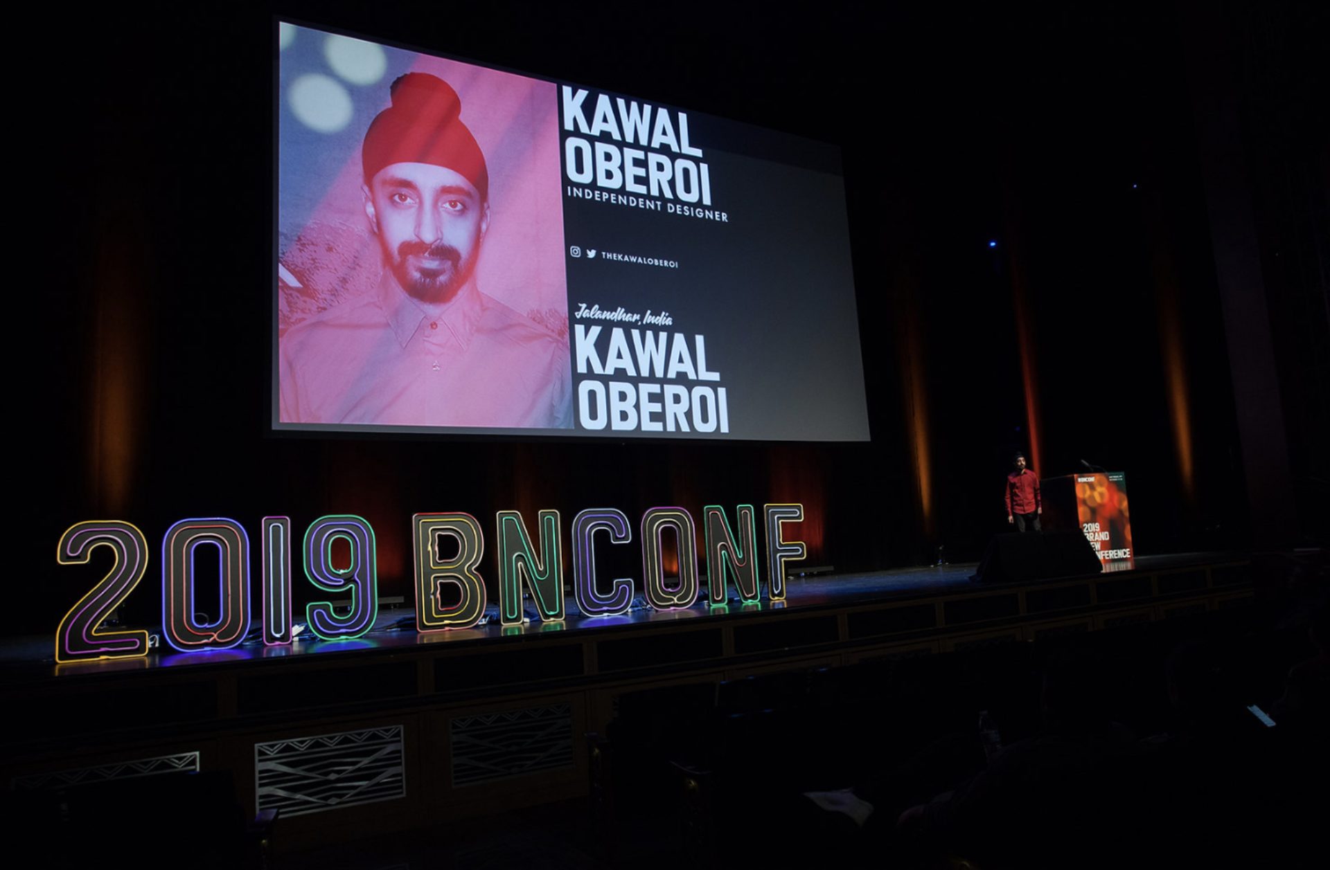
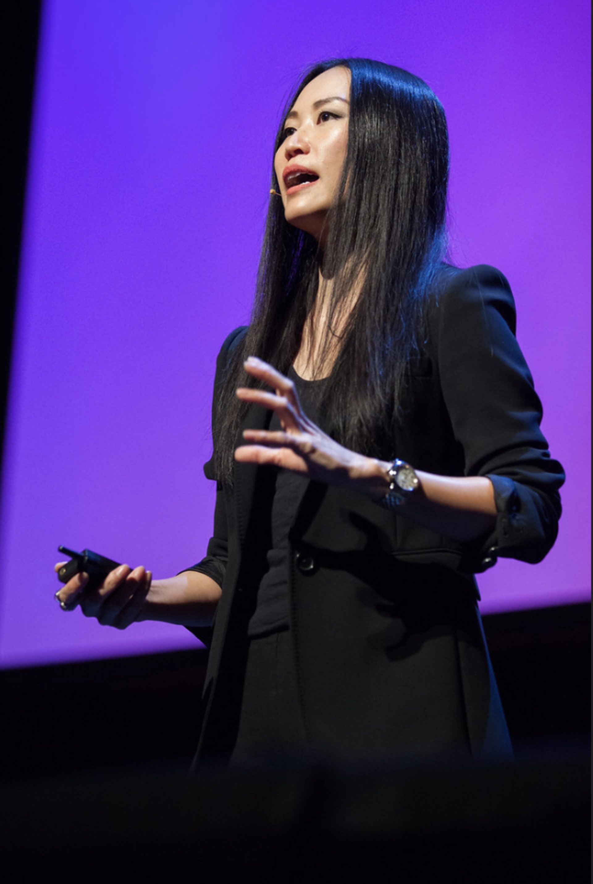
“When we are looking at the speakers to bring in, we invite some established designers as well as some wild cards, people who you’ve never heard of. We’ve had about 200 speakers in the Brand New conference.”- Bryony Bottom Right: Pum Lefebure, co-founder, CCO Design Army
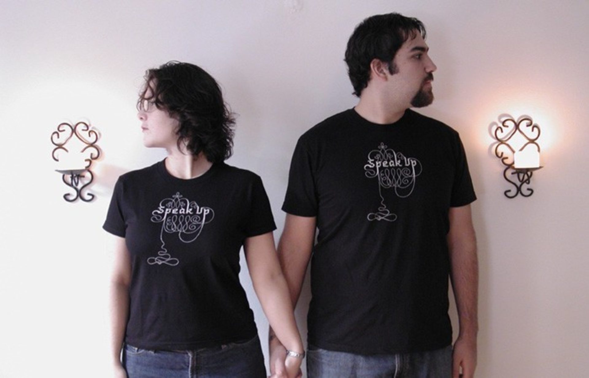
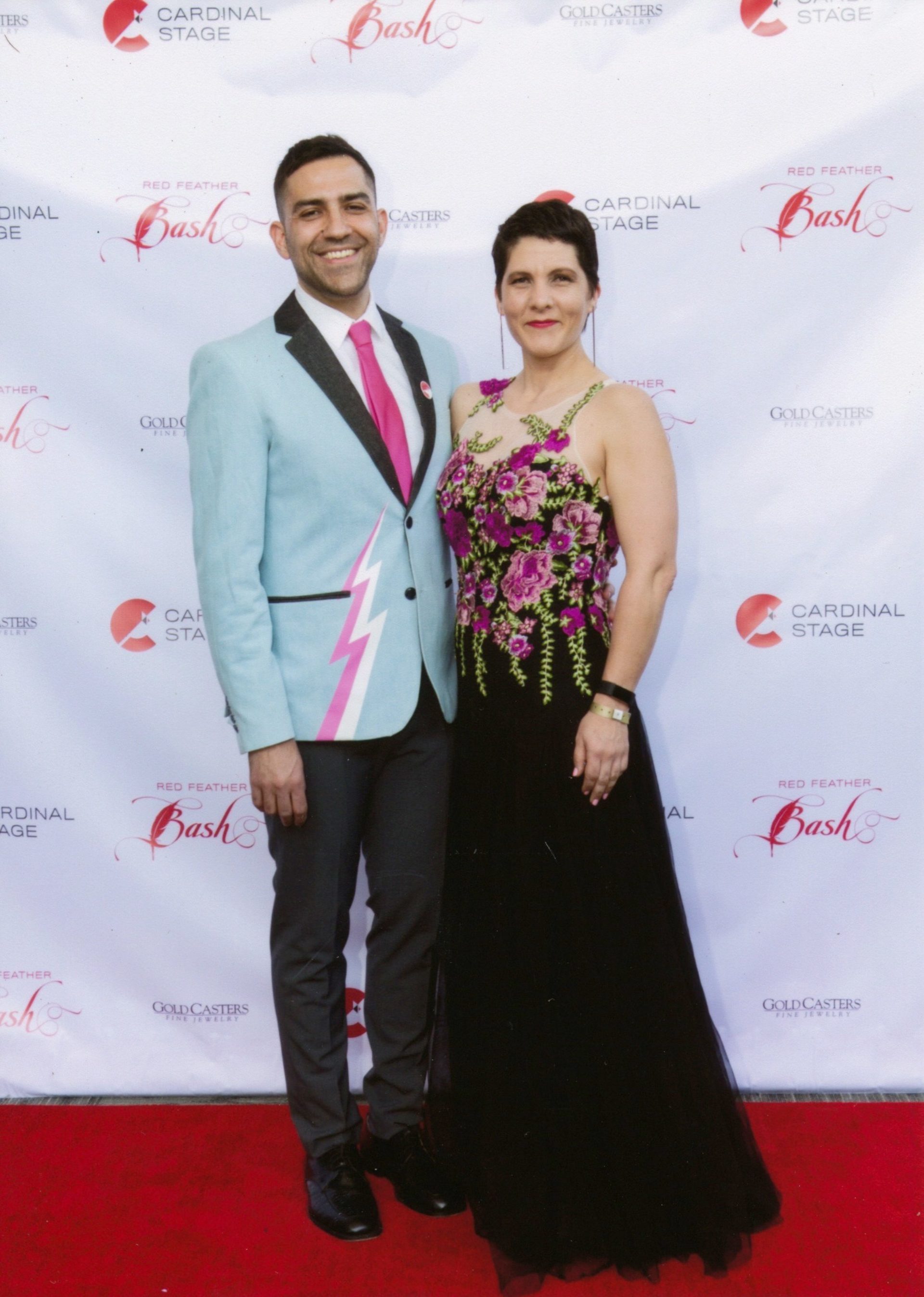
Left: Early days shot of Armin & Bryony taken to sell their first Speak Up T-shirt designed by Marian Bantjes. Right: Armin & Bryony dressed up for a Gala in 2019
How has design changed since you started?
Armin: In the last 15 years, the importance given to graphic design by clients and the public is fairly dramatic. It used to be that we would make fun of, “My doctor mentioned fonts. He said the word ‘font,’ and I giggled.” And now everybody has a favorite font. They understand what we do. For a long time, designers thought: “We need a seat at the table. No one respects us.” Now we’re there, and it’s almost too much attention.
Bryony: We used to think: “I need to educate people about what design is, so I am a level above them.” We are no longer there. Everybody knows about the importance of design, so now client and designer are equals.
Armin: Yeah. We used to look down on clients. We felt we needed to educate them, as if that made us better somehow. But now they are educated, and they come back with really good feedback. I might not like that it comes from the client, because it shouldn’t, but that happens more and more. The other thing that’s changed is how the public acknowledges design. When we started Brand New, no one covered logo changes. It was just Brand New, and that was it. And now The New York Times, Vanity Fair and Wired covers it.
Yes, but what you two bring to it that’s different is that you are designers as well. The other coverage is by journalists.
Bryony: And ours is a personal voice, whereas the others come from companies with different people are managing that column. But in our case, it’s just us. You can see the growth over the last 13 years that Brand New has had.
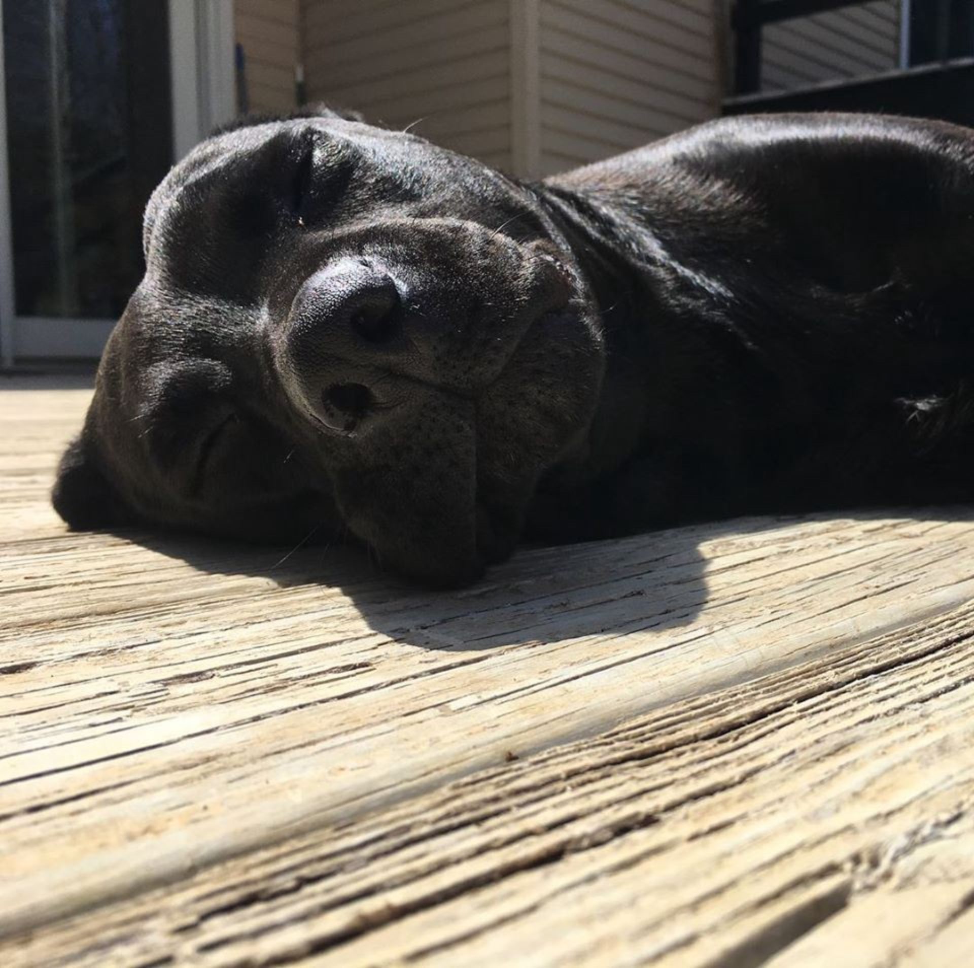
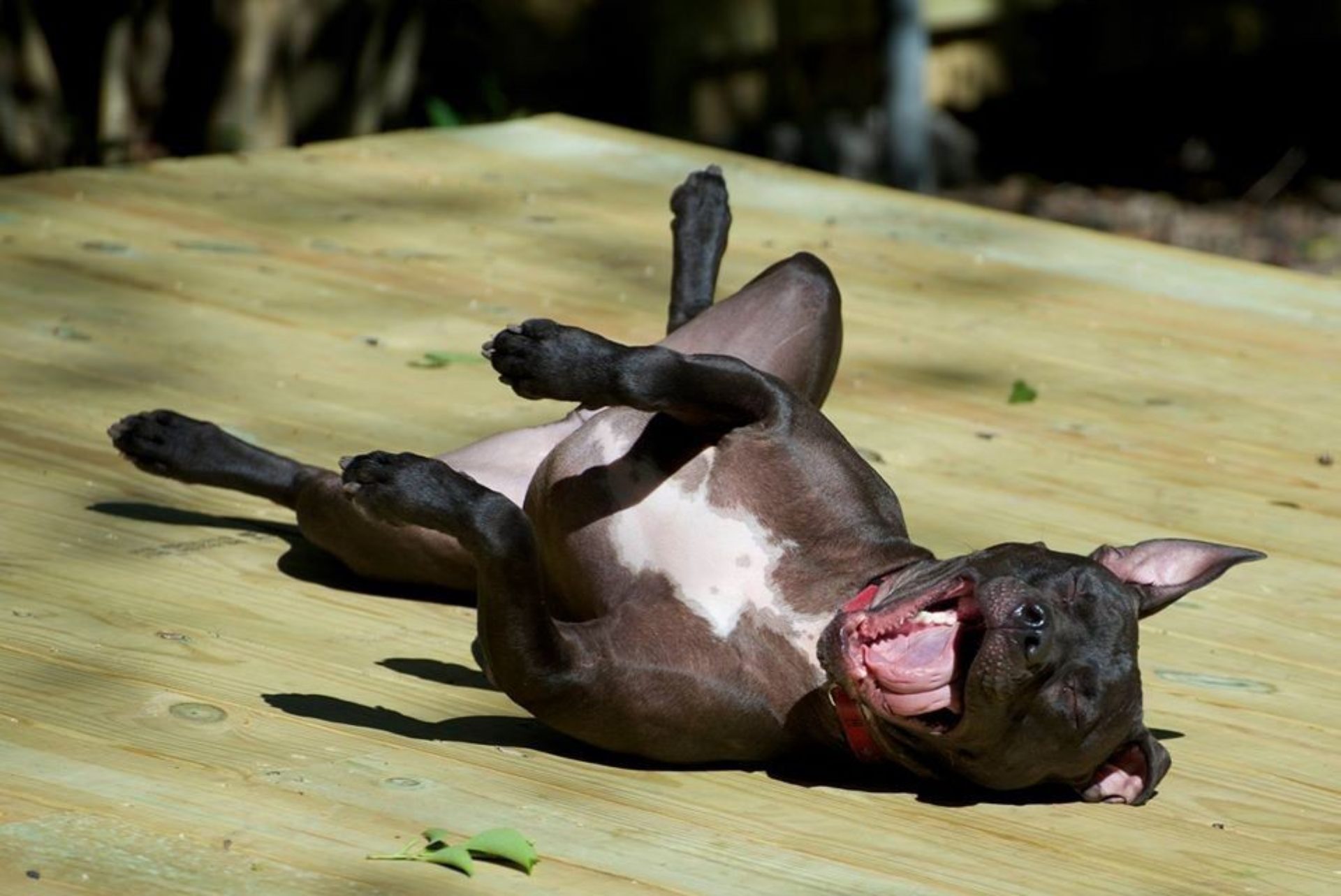
Left: Frida Right: Mamut. Both dogs live and work with Armin & Bryony in their home studio in Bloomington, Indiana
Armin: Also, in the early 2000s, there were magazines. AIGA had local chapters and the membership revolved more around what that specific AIGA was doing. Now there isn’t a big need to come together every month. The way designers consume content has changed quite a lot. There are no more design magazines, which is crazy.
In your opinion, how has UnderConsideration impacted that change?
Bryony: Starting with Speak Up, we questioned a lot of big, heady things like whether designers should be certified. We helped connect established industry designers to emerging designers and people in remote areas. They were all having the same conversation. That had not happened before. That shaped how we talk about design, which has now expanded to conferences.
Armin: The fact that we’re not a big corporation means there’s no editorial guidelines. We make things up as we go, and it’s very personal. We try to make everything as accessible as possible. With the conference, we go to nice venues that have green rooms, but we don’t tell our speakers about the green rooms because we want them out there with everyone. Let’s break down those barriers that are usually put in place. We’ve never thought of ourselves as being entrepreneurs. We’re survivors.
Bryony: We’re just trying to find a way to make it work.
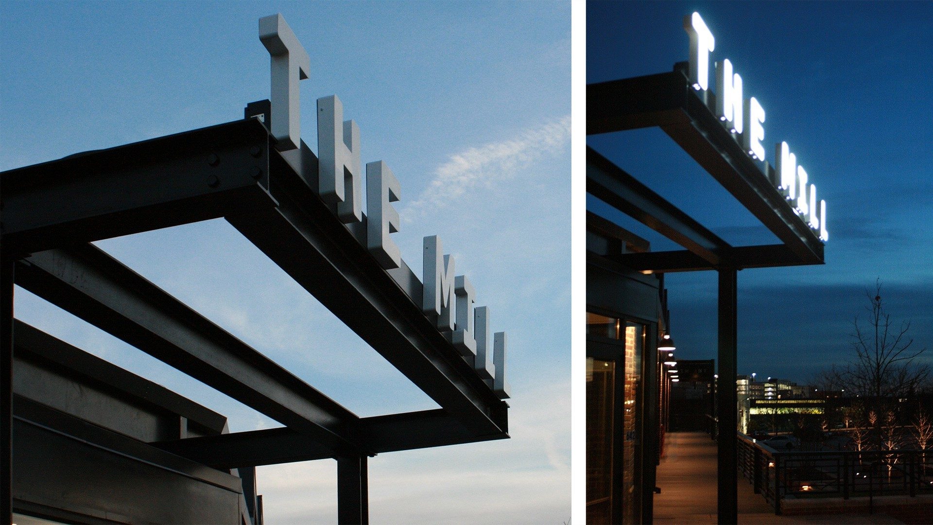
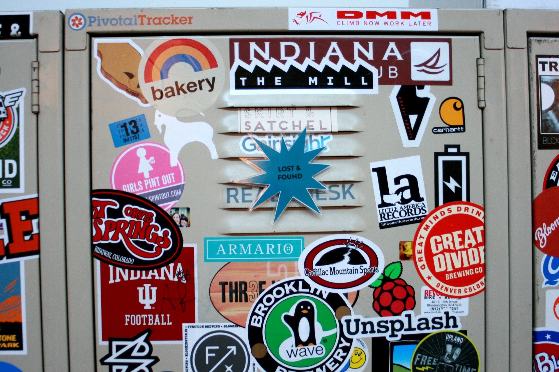
Armin and Bryony created the brand identity for The Mill, established in 2018. The Mill is a non-profit co-working and business incubator space in Bloomington, IN.
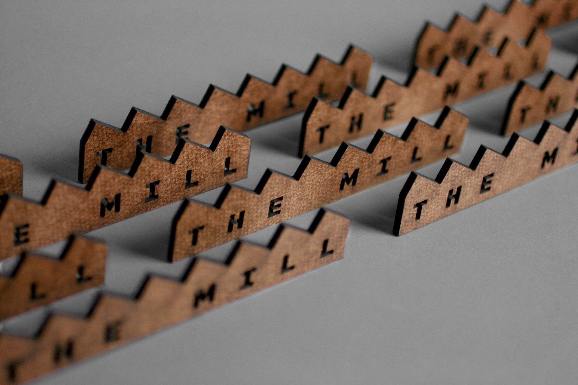
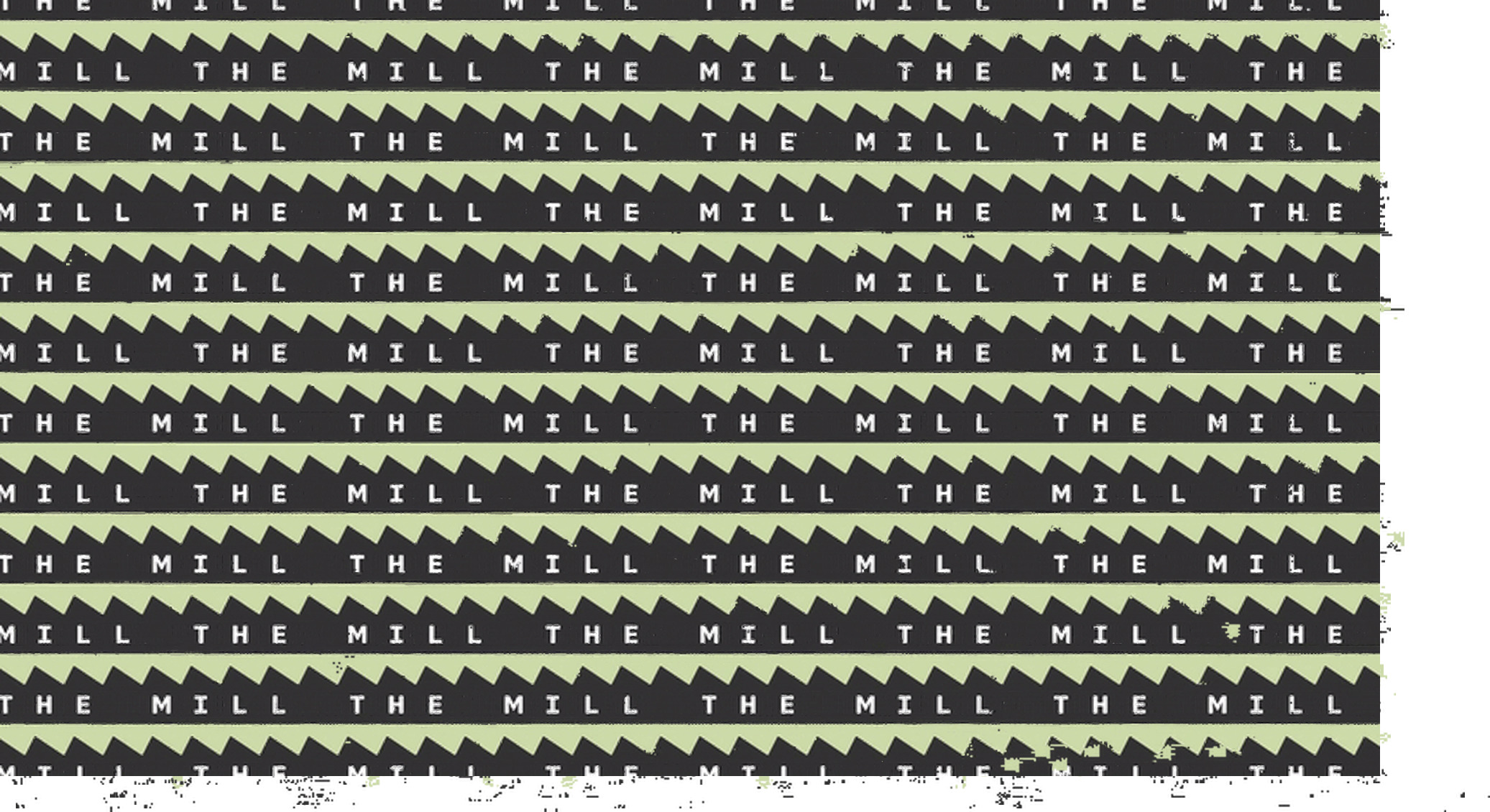
“Based on the premise of the primary logo — of one letter per roof segment — we created a custom font that follows the same monospace approach and provides The Mill with a simple and easy-to-implement identity element to establish their own visual language. We modified DDC Hardware to have wider characters and rounded corners throughout while changing up some characters to better fit the design.” — Armin
Armin: We want to be a profitable company with the things that we need at our disposal. We’re really bad at business development. So, when the economy tanked, we thought, “How do we get clients?” No idea. That’s a skill we never developed. We had to figure out what we needed to run a business. That accessibility — that idea that if we can do it, anybody can do — is a message that we try to put out there.
There’s a universal feeling when designers hear their work is being covered on Brand New. Initially it’s happiness, followed by trepidation because they know there’s always a critical component. But I’ve also heard you talk about trying to stop the de facto negative reaction to something new. Do I have that right?
Armin: Yes. Every now and then, I see a new logo and think, “Oh, this sucks” or, “This is great.” But then I take an hour or so to chill out and think about it and ask myself: “What does this mean? Why do I like it or not like it?”
We’re all so impulsive, especially online. There’s instant gratification in scrolling through quickly, thinking “That sucks,” and continuing to scroll. That makes people feel good. We try to slow it down. Even on Brand New, I’ll mention something in my review, then see a comment from someone who clearly hasn’t read it. People look at images, then go straight to give their opinions. No matter how much we try, that’s still going to happen. That’s how people react in real time.

“In a nutshell, nothing Facebook does right now will be considered positive and will be judged against their ongoing privacy issues, their role in the previous election, and all the other maladies listed at wiki/Facebook#Criticisms_and_controversies.”
And you use Brand New to provide context. When you posted about the new Facebook logo, I thought you made a really good point about this not being a good time to change the brand because they’re under so much scrutiny. What guidance would you give a brand about when it’s time to make a change?
Armin: The best time is when a company is ready to make a positive change on the inside — or when they’re about to introduce Version 2.0, 3.0, whatever it is.
Bryony: When there’s a true reinvention or evolution of the company.
Armin: Yeah, when the publicity is good, it’s because the company has good momentum. When a company changes to throw something under the rug or signal change, it never pays off. Take AirBNB as an example. They began with their silly script logo. When they were ready to take over hotels, they redesigned. It was tied to growth. That’s when it really works.
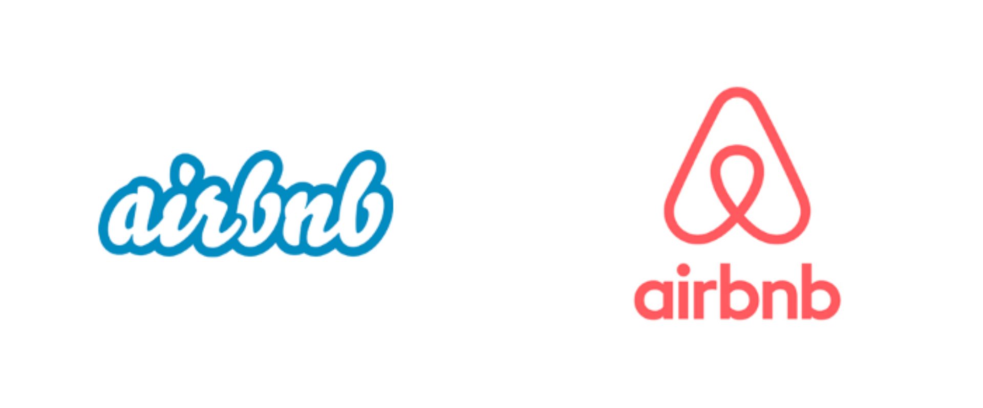
Reviewed by Armin July, 2014. “To be more clear: this is a great icon. These days it’s really hard to come up with an icon that can serve as an immediate identifier and sometimes it isn’t about the icon — see Nike’s swoosh (which ain’t worth shit on its own — seriously, imagine it being launched today) — and more about the meaning imbued behind it through very dominant use and user adoption. Airbnb, right now, has the momentum to build all the meaning they want into this icon and I have a feeling they are going to pull it off.
And that one in particular was pretty polarizing.
Armin: Yeah. What’s funny is that people said: “Oh, it looks like genitals. It looks like breasts.” But now, no one talks about the logo like that. AirBNB is one of the most profitable, well-run companies out there, and the logo doesn’t matter. It matters when it’s announced. Then people move on.
It can be challenging today with clients who pay almost too much attention to the response. They don’t have the patience to give it time.
Bryony: This comes back to what we were talking about in the beginning with consumers being educated on design and more invested. All of a sudden, they have higher expectations and make demands of companies — whether it’s about the environmental or social and cultural consciousness. The more educated and aware consumers are, the harder it is for companies to ignore.
What would happen if you were sent a logo/identity where you had no critical comments?
Armin: If it’s a well-known company, product or service, and I’ll at least say: “I have nothing to say.” If it’s a small local or regional client and the design is so-so, there’s no point. No one is going to care.
What are the positive trends and negative trends you are seeing happening right now in logo design?
Armin: The biggest negative trend right now is everybody doing the same thing with the geometric sans serif. AirBnB was one of the first. Then Google did it, and everybody was like, “Oh, it worked for them. Let’s go with that.” You’d think the trend would only last two or three years, but that was 2014. And it’s still the default.
There’s also a trend toward simplicity so that the logo performs well on screen. You can shrink it. You can enlarge it. That’s all great. But you put 10 companies from different industries together, and they all look exactly alike. In the 1980s or 1990s, they might not have had the best logos out there but you could tell: This one does computers. This one does sports. This one does food. Now, they all look the same. We’re stripping away a lot of personality for the sake of functionality, as opposed to creating memorable, distinctive visual gestures.
Bryony: They’re just blending into the room instead of being the eccentric uncle.
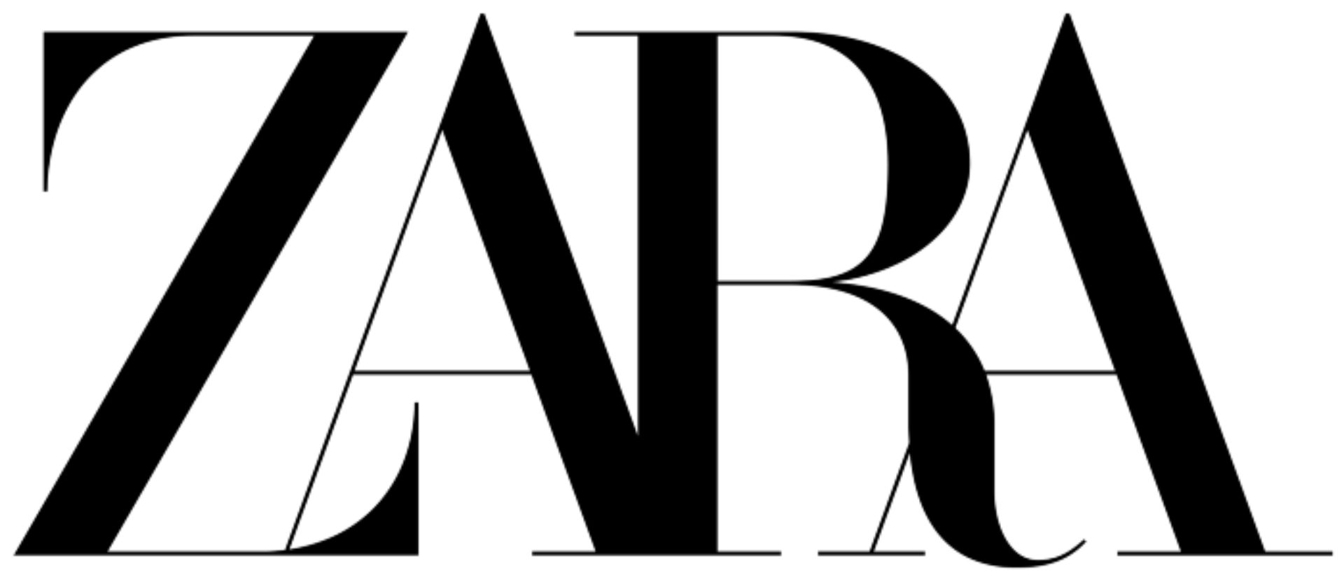
Reviewed by Armin, January, 2019. “Overall, given the trend of fashion logos, let’s mostly appreciate that Zara didn’t change to an uppercase deadpan sans serif and instead doubled down on something more unique and (even though I hate this word) disruptive for today’s aesthetic trends.”
Armin: One positive trend is execution. It’s rare for a company or a design firm to do a bad logo or identity nowadays. Everything is well done. Even if it’s trendy, it looks good. When we started Brand New, at the end of each year I rounded up the Best Of and the Worst Of. I would have 20 things where I thought, “This is the worst.” It was an endless list. In the past three years, I’ve had to scrounge for three or four. There’s a trend towards being more efficient, being better, and looking polished.
Bryony: There’s a lot of fine.
Armin: But at least we’ve gotten rid of the really bad work that was happening at top companies. So that’s a good trend.
Armin: Motion graphics have changed things. It used to be only large company could put ads on TV or digital billboards. Now, we all have digital billboards in our hands. You can animate an Instagram stories. We all have the same tools. That really has made a difference in how small brands can compete and tell their stories. Before, they didn’t have the access to the same broadcasting tools.
Are you seeing more video for brand launches or identity change?
Armin: Yeah, perhaps a little too much, to the point where it’s: “Oh, we’ll just do a videos.” A lot of companies use stock footage, and it feels like they don’t care. They’ll say, “Come visit us in Stockholm,” but show footage of Canada. But I think in the end, it is better because you can tell a compelling story in 30 seconds instead of a long press release no one is going to read.
Where did the name UnderConsideration come from?
Bryony: It’s just very descriptive. Things are always under consideration.
Armin: But if you want the real, not-glamorous reasoning, speakup.com was taken. “Under Consideration” was available. It fit but was never intended to be our company name. At the time, we had no idea there was going to be more. It wasn’t a big strategy. I often wonder if speakup.com had been available, what would we be? We might have been limited to that one blog.


Bryony and Armin both love hiking the trails and parks in Southern Indiana with their two children and dogs.
It seems like you’ve lived your lives by keeping everything under consideration, even in terms of where you live. You’ve been in Chicago, New York, Austin, and now you’re in Bloomington, Indiana.
Bryony: Yeah, we’re constantly questioning things.
Armin: It’s not like we wake up one day and say, “Something’s wrong.” We consider what’s going on and figure out how we move forward. When we moved to Bloomington, we felt something was happening with Austin’s political climate. We thought: “All right, we need to take stock and figure out the best way forward.” We just take all the things that we have at our disposal into consideration to move forward, hopefully in a positive way.
Bloomington is an unexpected choice. I read somewhere — it might have been ironic — you said you feared losing street cred by basing yourself in Bloomington. Have you found that to be true?
Bryony: No.
Armin: No. Initially when I was on the phone and someone asked where I was located, I would try to downplay it. I’d say: “Bloomington, Indiana. We just moved from Austin, Texas.” As if I had to excuse myself for moving here. Now it’s just like: “Hey, we’re in Bloomington, Indiana. You’ve never heard of it, but it’s awesome.”
That also happened when we moved to Austin. When I moved out of Brooklyn, a client noticed and said, “You’re clearly not in New York anymore.” I thought, “Oh my God, what have I done?” But then you just do it with conviction.
Bryony: We chose very consciously to move to Bloomington knowing people would think we’re crazy. But then you own it. It takes about a year every time we move to assess a city. We’ve been here two-and-a-half years. So now, things are very established. The kids are fine. We’re fine. Once you know your way around, it makes a big difference. There’s something to be said for being in a dot that you can help expand little by little.
Armin: Also, if you search by location on Behance, we’re number one. We have the most likes of all of Bloomington, Indiana. It’s the little victories that count.
You guys talked about not wanting to have clients and creating your destiny through creating your own projects. Is that happening? Is that still the goal?
Bryony: For the most part, yes. We take on a few client projects, but they have to be interesting. We have such a good system, and we move very swiftly through any creative process. We don’t particularly enjoy going to meetings and debriefings unless it’s for an extra good reason.
Armin: It’s not that we’re picky or snobby. The biggest hurdle in client work is time. It’s just the two of us. The conference and blog take up so much time that it’s hard to take on a client. There’s more pleasure in getting away with what we do. We’re paying the bills. We’re contributing to the design society. And we’re enjoying it.
With clients, there’s waves of excitement and lulls. I get really excited in the first round of logos, but by the time we get to doing guidelines, I don’t care. With the conference, the excitement level is always up. We’re always on edge in a good way.
Bryony: We feed each other’s excitement. When one of us is working on something, the other one is waiting to see what comes out of it. We have the same common goal. With client work, you don’t have that. There’s a deadline, and then that’s it.
How is it being married to your partner? Do you have a clear division of roles?
Armin: It’s very, very clear-cut.
Bryony: Don’t ask me to code.
Armin: That’s what makes it work. We’ve figured out who does what best. For example, I design the conference materials, but Bryony is good with manual assembly and bringing them to life. We complement each other well.
Bryony: There’s a deep level of respect, but at the same time, there’s no bullshit. If Armin shows me something I know is not fully baked, I can be like, “You know what? Don’t show it to me just yet. You have to work more on it.” And he’s like, “Yeah, I know.” But there’s no hurt feelings either.
Bryony: Worst-case scenario, we take over each other’s work. That happens more with client work. The biggest conflict we have is with each other’s InDesign files. To her, her files are perfect. To me, my files are perfect. When we get into each other’s files, it’s like: “Why did you do this like this? It’s insane.” Little things like style sheets and organizing things are the only place we clash. We try to avoid it.
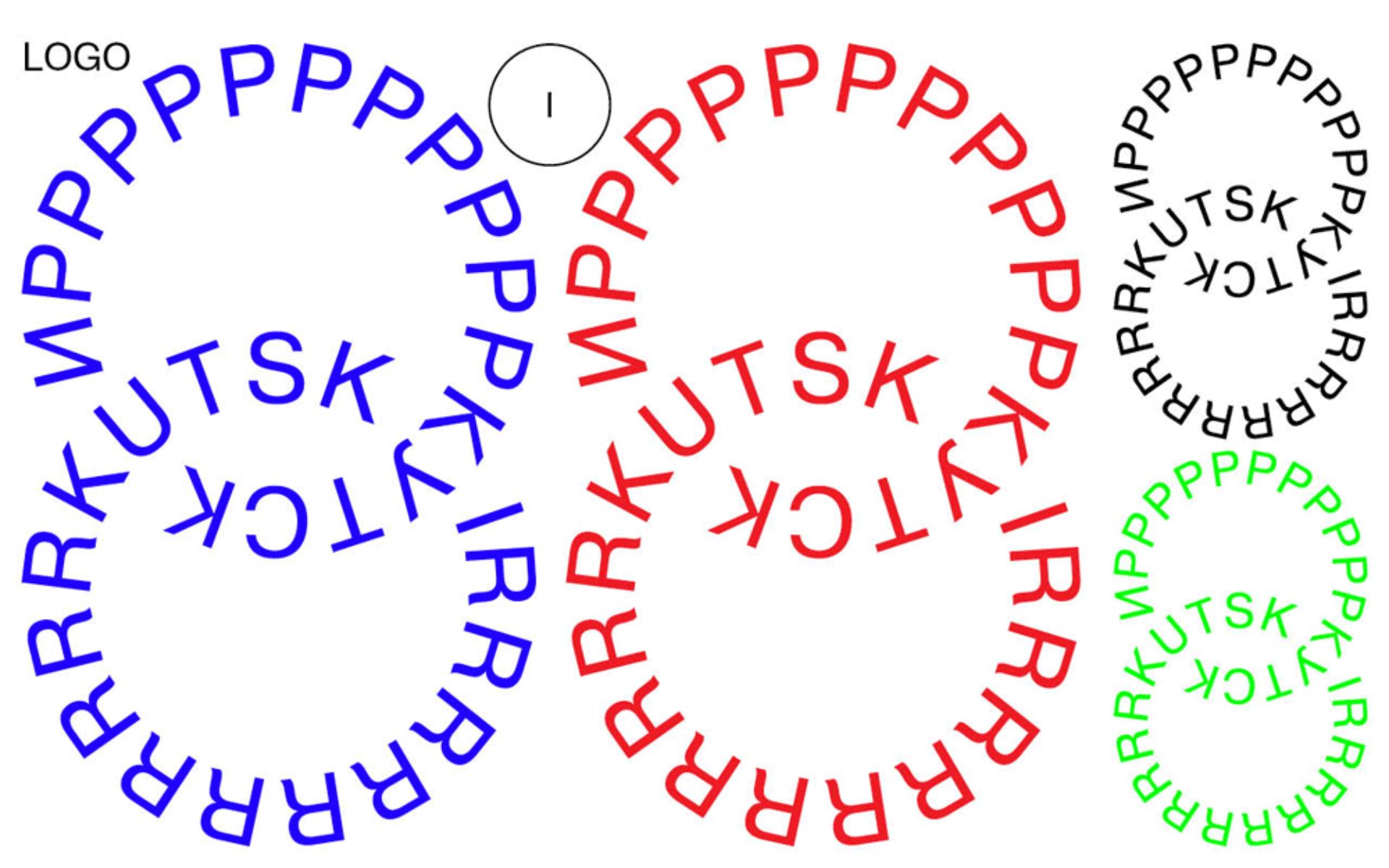
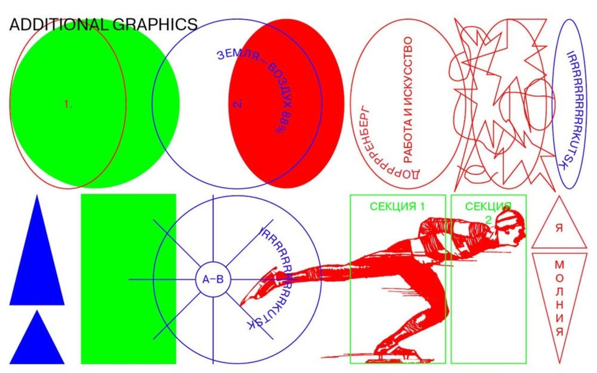
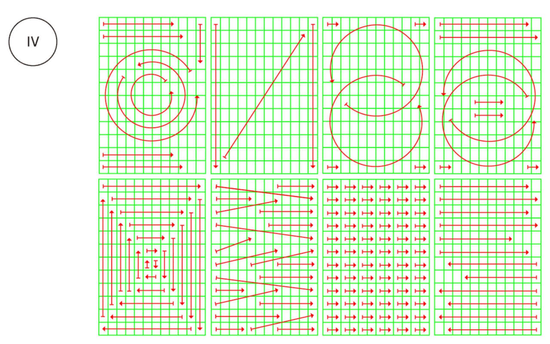
Reviewed April, 2018 by Armin. “If this morning you woke up and thought, “I hope to see something different today on Brand New”, it’s your lucky day. The whole identity is a bit of a shock and it starts with the logo that presents the name of the city in Latin and Cyrillic as interlocking circles with the second letter of each repeated as many times as necessary. Why? It doesn’t really matter as pretty much everything else in this project asks “Why not?”. For some really strange reason I rather like the logo. Despite its chaos-ness, the way the two languages interlock brings some order that creates an interesting tension in the logo. I even like, or appreciate, the use of Helvetica in this case.”
Bryony: South America is starting to show some really interesting work. I’m not going to pinpoint it to one country or another. There’s little pockets that are definitely talking to each other. You can see connections. I think in five to seven years, you’re going to see maturity come from Latin America.
Armin: It used to be there was nothing coming out of Mexico, and we’re from there. Part of the reason we didn’t go back was that we didn’t see a future. But now, the amount of branding stuff coming from Mexico is mind-blowing. It’s amazing — really top-notch, really experimental, but also well-grounded. Then there’s always the usual suspects like Finland, and Norway.
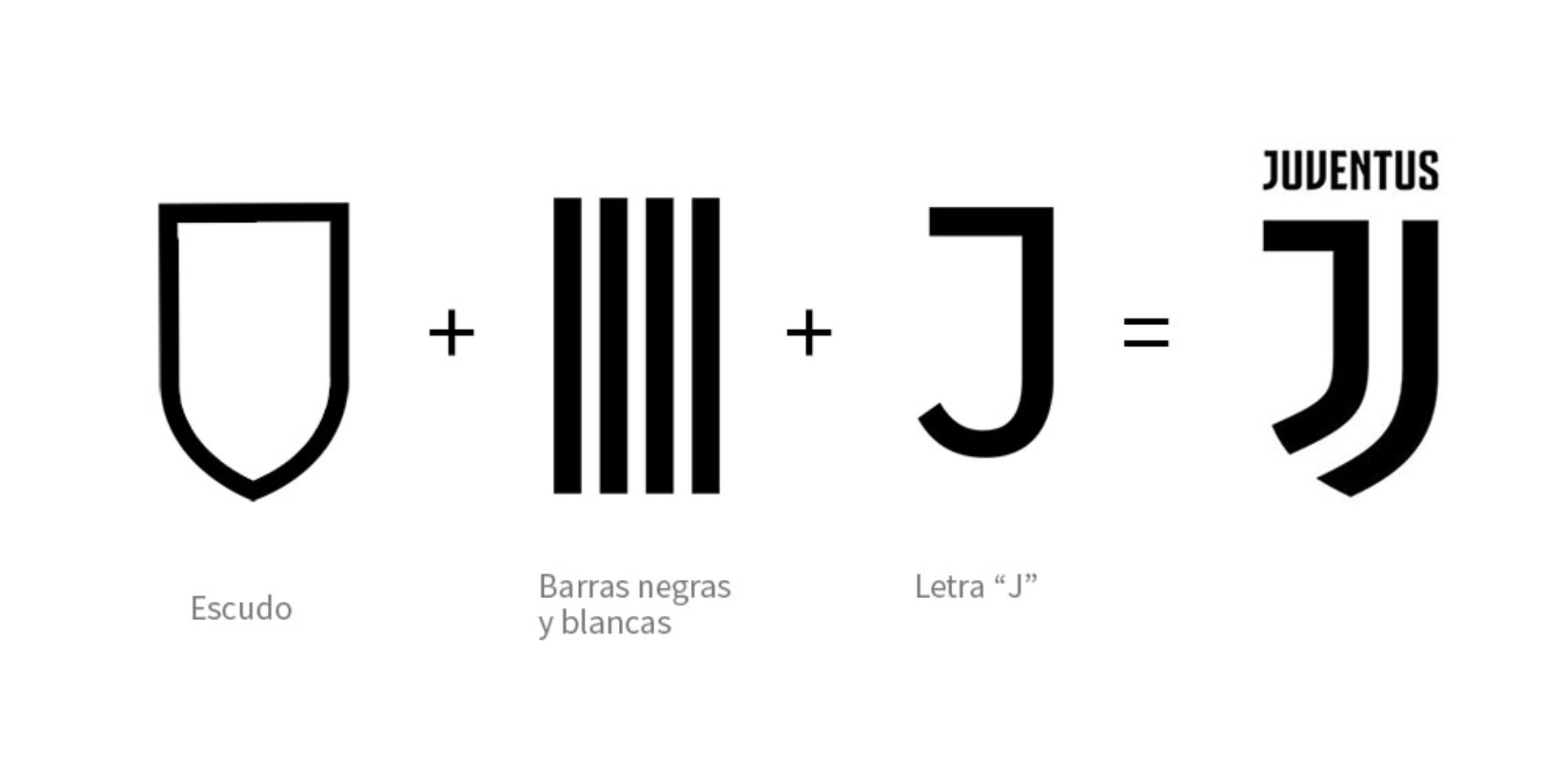
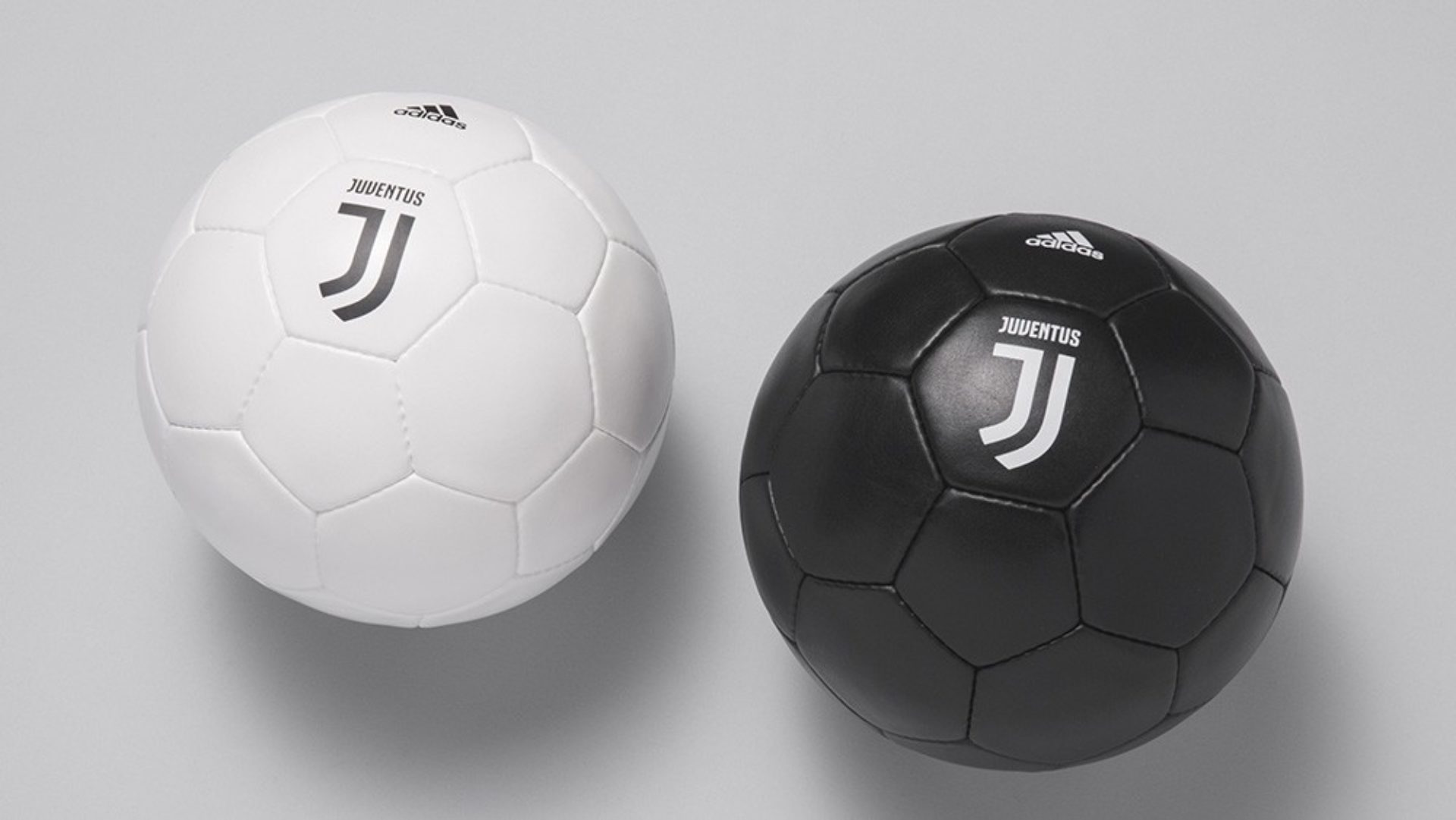
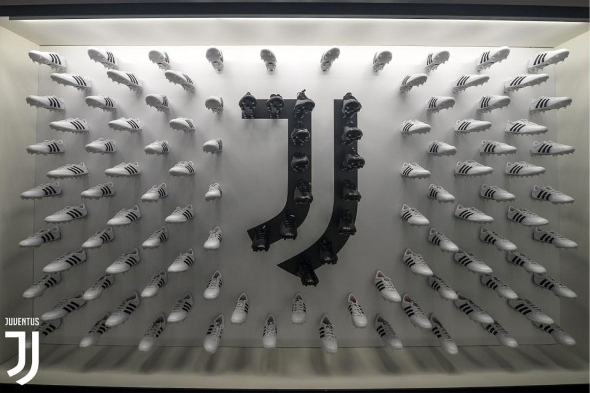
Juventus, was reviewed by Armin in January, 2017. “Established in 1897, Juventus F.C. — or Juventus, or Juve, or I Bianconeri (the black-and-white) — is a professional Italian football club based in Turin and, arguably, one of the most famous and successful teams in soccer history. Fans and purists will disagree but the new logo is excellent, regardless or perhaps specifically for how it breaks from convention and tradition and dares to do something different for this specific category.”
Is there any particular sector you think is doing a good job in branding right now? I know you had opinions on the fashion.
Bryony: Not fashion.
Armin: Yeah, fashion is very disappointing right now. But I think sports is doing well, especially soccer. In the beginning, soccer tried too much to be like the NBA and NFL. Now it’s more like: “Hey, we’re soccer. We’re different.”
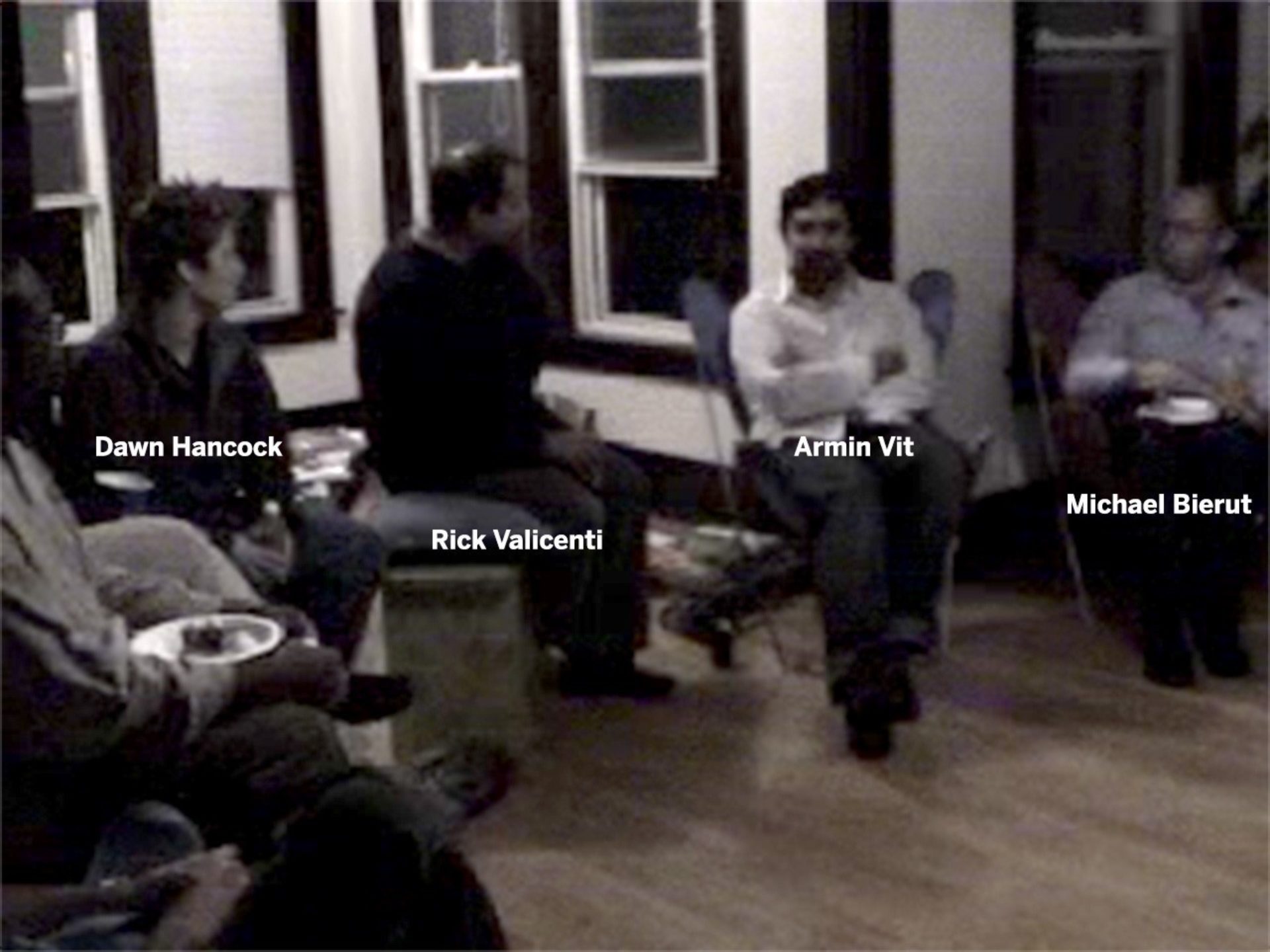
“The very first public event we had for Speak Up was in our apartment in Chicago with 20 people. Rick was our speaker. The morning of the event, Michael Beirut asked if he could attend since he was in town for work.” Armin
Okay, I want to hear the story of Rick Valicenti in Chicago.
Armin: In 2001, we were in Atlanta and ready to move on. Since college, I had been a huge fan of Rick Valicenti and David Carson — all the weird late ’90s designers. I set up an interview with Rick and drove out to his home in Barrington, about two hours from Chicago. When I got there, I met Chester, his designer at the time. He didn’t know where Rick was or if he’d show up. I started showing my work to Chester instead. About 9 p.m., Rick calls from Chicago. Chester says, “I think you should come see this guy. He’s interesting.” Rick comes over, loves my work and tells me to come back in two weeks, stay at his house and meet his other partner. I went back home really excited.
A few weeks later, I flew back to Chicago. Rick picks me up from the airport and tells me we’re going to a rich friend’s house where there will be a hayride. He says it will be weird but interesting. I thought, “Fine. I’m with Rick Valicenti. It doesn’t matter.” We talk design all afternoon and evening, and I’m in heaven. We go to the hayride, then come back to Rick’s house and start watching Saturday Night Live. Brittany Spears was on, and I can’t believe I’m with my hero talking about Britney Spears on SNL. That night had had me sleep on his sofa bed with his three new kittens.
Bryony: Well, I don’t think you slept.
Armin: Yeah, because the kittens were on me. I didn’t want to roll over and kill one. The next day, Rick drove me back to Chicago to meet his other partners — but it happened to be a bad time because one of his partners hadn’t told Rick that he was leaving. That left me in limbo for two months, and the job never happened. But I cemented a weird bond with Rick. In a way, it was great that I didn’t go to work for him, because I might have never left. All of this might have never happened. It’s sort of a blessing in disguise.
Didn’t he come to your living room in the early days and do a speaker series?
Bryony: The very first public event we did was in our Chicago apartment with 20 people. And he was literally sitting on the floor, moving his posters around with a cat on top because the cat just wanted to lay on the poster. It was a very homey event.
Armin: The morning of the event, Michael Bierut from Pentagram emailed me and said, “I’m going to be in Chicago for work at United Airlines. Would it be okay if I come to the Rick event tonight?”
Bryony: We said: “We can make it 21 people, no problem.”
I know Michael’s been kind of a mentor to you guys. Is there any pivotal thing he did for you — or has he just been there throughout the years?
Bryony: It’s been important for Armin to witness Michael in meetings. That’s where I saw a very clear change in Armin, like: “Wait, we’re not going to wing it. We’re going to do it this way, and this is how we’re going to approach certain things.”
What was it about the meetings that affected you?
Armin: He was just so calm. Even when meetings were crumbling , he kept his cool. He always found the right thing to say — whether it was, “Fine, we’ll go see what we can do,” or saying, “No, this is it. This is how we’re doing it.” By the time he finished speaking, it perfect sense.
One thing that empowered me was seeing him walk away from projects. After the first meeting, he would be like, “This is not going to work out. Let’s just walk away. Don’t push it. Don’t do it for the money. Don’t do it because it might be good for your portfolio. Just walk away.”
He was also one of the first major names who told other major names to read Speak Up. I remember being at Bryony’s best friend’s wedding in the Dominican Republic the first time hw left a comment on the blog. I was freaking out in the Dominican Republic, like “Oh my God, Michael Bierut left a comment on my blog.”
And you’ve covered his work in Brand New, right?
Armin: Yes.
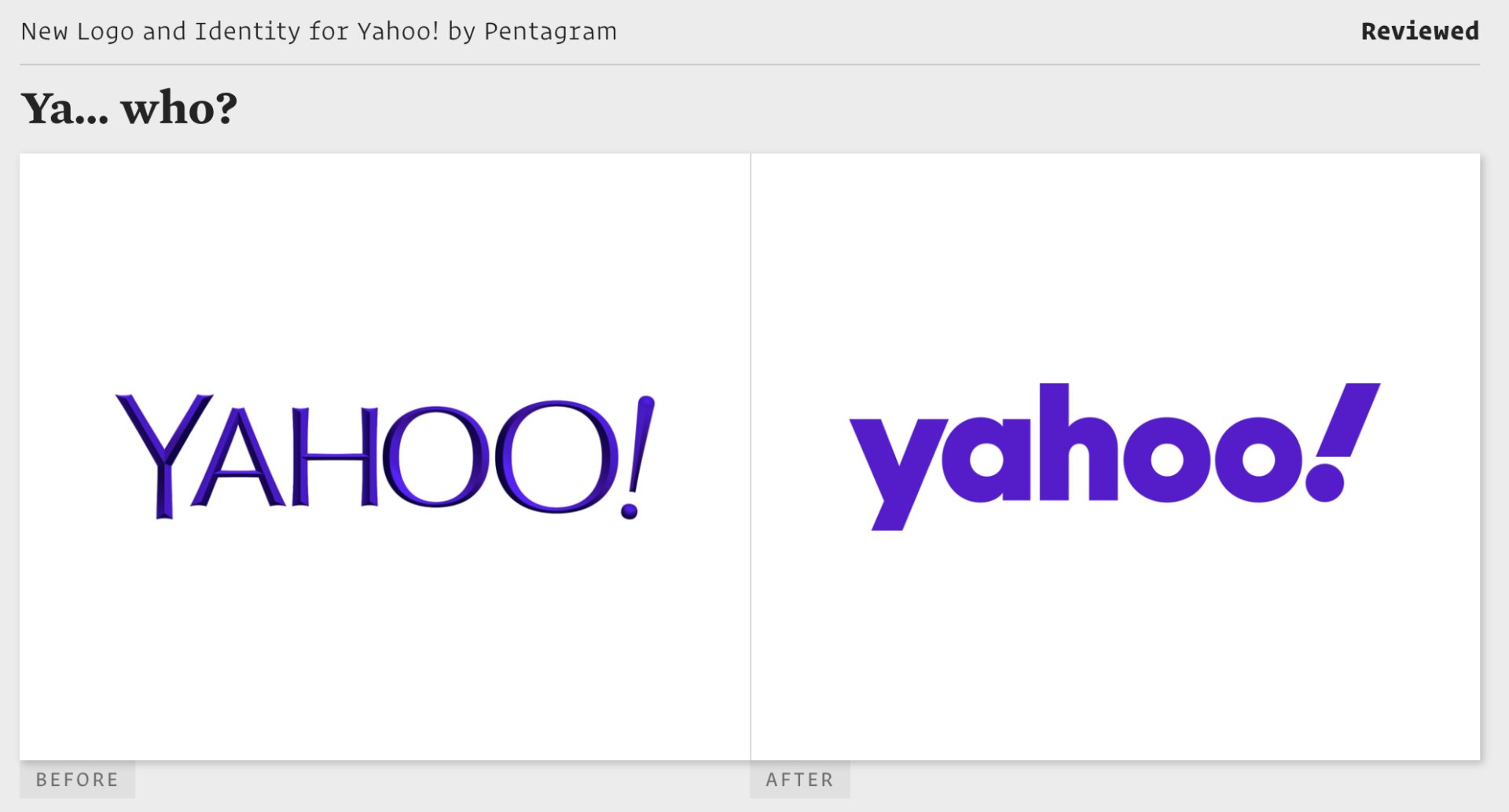
“The new logo is perfectly, absolutely fine. The new logo is also perfectly, absolutely indistinguishable from a hundred other logos to come out in the last two, three years. Even the exclamation point, at its vertiginous 22.5-degree-angle, passes unnoticed, blending in with the rest of the nice, round, amiable letters every company has grown complacent with as a solution to a new logo.” — Armin Vit, Brand New, September, 2019
How is that?
Armin: It’s one of the worst days of my life when I have to review Michael’s work. What was the latest one? Yahoo, another geometric sans serif. When he came out with a generic look like everyone’s doing, I couldn’t just say, “Yay, Michael, my hero did another great job.” No, it was ho-hum and mediocre. An hour later, I emailed him: “Are we still friends?”
And what did he say?
Armin: He’s like, “Yeah, it’s fine.” But I had given faint praise to the previous logo. He said, “I can’t believe you gave praise to that, but not mine.” He still finds humor in things. I think he’s one of the designers who is the most able to detach his feelings from the work, at least publicly.


